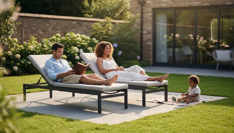
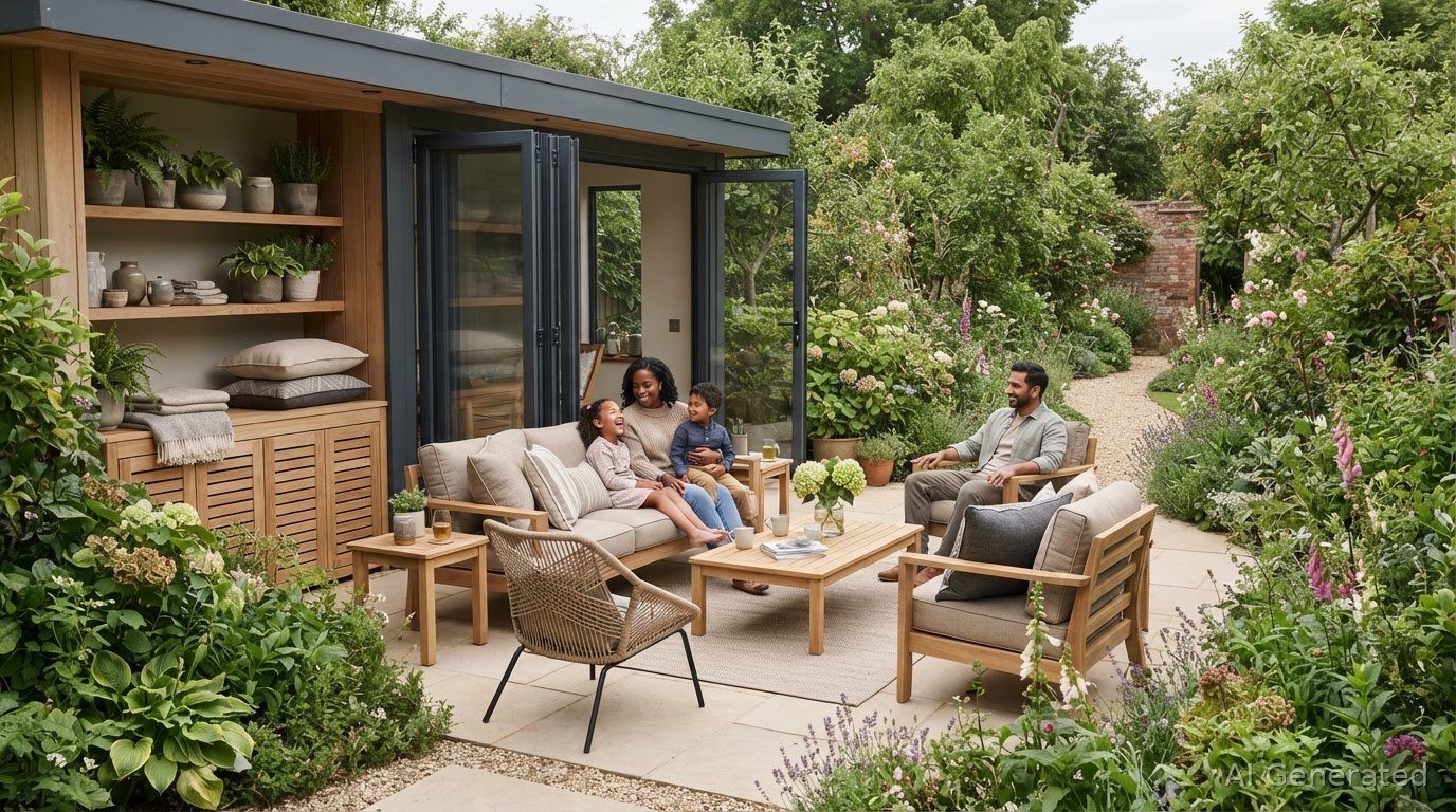
Outdoor cushion colours to suit your garden and furniture
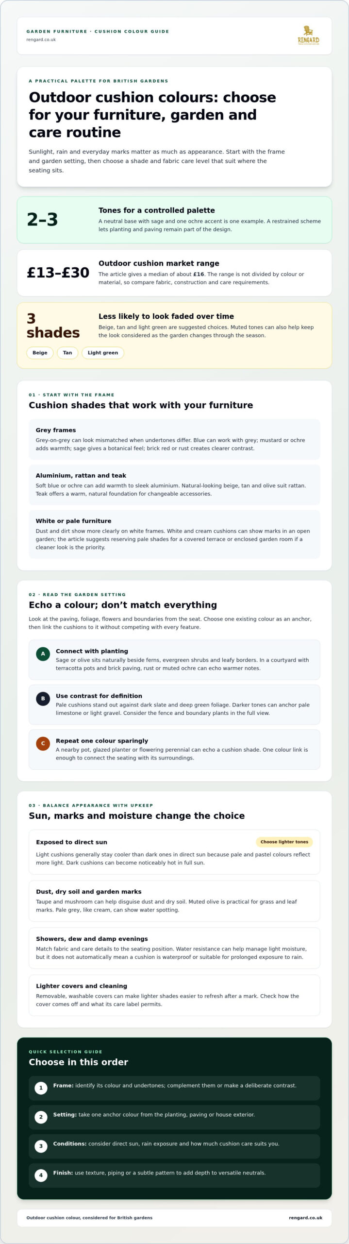
The most durable-looking cushion colour isn’t always the brightest. Beige, tan and light green are good choices for outdoor cushions because they’re less likely to look faded over time. Taupe and mushroom can also help disguise dust and dry soil in a British garden. The best colour for outdoor cushions depends on your furniture, surroundings and how much care you’re happy to give them.
Colour helps a garden seating area feel considered, but sunlight, rain and everyday marks matter as much as the palette. Choose shades that work with your planting, paving and furniture, and weigh up fabric care alongside appearance. Contrast, pattern and texture can make cushions inviting without adding unnecessary upkeep.
Key Takeaways
- Pair grey furniture with cushion shades that complement its undertones, or use contrast to avoid a mismatched, flat look.
- Echo a colour from your planting or paving, and keep the palette restrained so the seating area sits naturally in the garden.
- Removable, washable covers can make lighter shades easier to live with; choose care-friendly fabrics for exposed seating.
- Use texture, piping or subtle patterns to give versatile neutrals more depth and warmth.
- Reduce visible fading by choosing muted tones, storing cushions out of the weather and rotating them through the season.
1. What Is the Best Colour for Outdoor Furniture Cushions?
The best colour for outdoor cushions depends on your furniture’s undertones, your garden palette and how much sun the seating receives. Beige, tan and light green are suggested choices because they’re less likely to look faded over time. Start by identifying the main colour of your furniture frame, then choose a cushion shade that complements it or creates a deliberate contrast.
Grey furniture can be surprisingly tricky. Grey cushions beside grey frames may appear purple, pink or yellow because their undertones differ. Blue often works well with grey, whose base threads may contain blue; mustard or ochre adds warmth, while sage creates a botanical feel. Brick red or rust offers clearer contrast without an obvious clash.
For professional colour-coordination ideas for patio furniture and garden surroundings, watch this video:
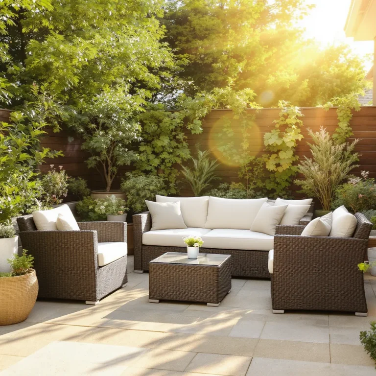
Match the cushion’s character to the frame material as well as its colour. With a sleek aluminium frame, soft blue or ochre can add warmth and definition. Rattan furniture suits natural-looking tones such as beige, tan and olive. Teak provides a warm, natural foundation, and changeable accessories can refresh the look without replacing the main furniture.
White furniture creates a bright, crisp look, but dust and dirt show more clearly against it. Beige or grey frames offer a similarly modern effect while making everyday marks less conspicuous. White and cream cushions can show marks in an open garden, so reserve pale shades for a covered terrace or enclosed garden room if you want them to look cleaner for longer.
Light cushions generally stay cooler in direct sun than dark ones because pale and pastel colours reflect more light. Dark cushions can become noticeably hot in full sun, so consider lighter shades for an exposed patio. Taupe and mushroom help disguise dry soil, pollen and dust; muted olive is practical for grass and leaf marks. Pale grey, like cream, can show water spotting.
Outdoor cushions typically cost between £13 and £30 on the UK market, with a median of about £16. The available market range isn’t divided by colour or material, so it doesn’t establish a separate price for either; compare the fabric, construction and care requirements when weighing up options.
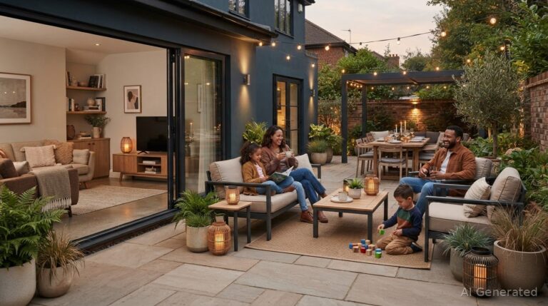
Finally, consider your home’s exterior. Echoing a colour from the brickwork, render, doors or window frames can connect the seating area to the house. If you’re unsure, keep the main furniture neutral and use cushions to add colour. A restrained palette lets planting and paving remain part of the design.
2. Coordinating cushions with garden planting and paving
Start with the colours already in view from your seat: paving, foliage and flowers. A slate patio, clipped box hedging and white hydrangeas create a different backdrop from warm sandstone, lavender and ornamental grasses. Pick one existing colour as your anchor, then choose cushions that connect with it rather than competing with every feature.
For a calm scheme, take a tone from the planting. Sage or olive cushions sit naturally beside ferns, evergreen shrubs and leafy borders. In a courtyard with terracotta pots and brick paving, rust or muted ochre can echo those warmer notes. Aim for a visual link, not an exact match: a slightly softer cushion shade keeps the composition considered.
Use contrast where the garden needs definition. Pale cushions stand out against dark slate paving and deep green foliage, while darker tones can anchor pale limestone or light gravel. Consider the whole view, including the fence and boundary plants. A dark charcoal cushion against a dark fence may recede, but lighter piping or a contrasting throw can restore its outline.
Keep the palette controlled. A seating area generally looks less busy with two or three tones, especially where planting already adds colour and texture. For example, pair a neutral base with sage cushions and one ochre accent. In a flower-rich border, quieter fabrics let blooms remain prominent. A simple palette can also distinguish a compact patio from its surroundings without making it feel crowded.
Repeat one furniture colour in the garden to create a deliberate connection. If your main cushions are muted blue, introduce blue in a nearby pot, glazed planter or flowering perennial. Avoid matching every flower; one echo is enough to integrate the seating. On a timber deck, green cushions can relate to surrounding foliage, while a small group of blue pots adds measured contrast.
Check colours in the light where the furniture will sit. A sheltered terrace beside a pale wall has a different visual balance from a sunny lawn edged with dark hedges. Place a cushion against the paving and nearby leaves, then view it from the house and garden path. This helps reveal whether its tone blends in, contrasts clearly or overwhelms the planting.
Finally, let the setting guide pattern and saturation. A naturalistic border with grasses, roses and mixed foliage can feel unsettled beside several bright cushion colours. Choose one stronger shade and repeat it sparingly, such as terracotta cushions with a few matching flowers. For geometric paving, restrained stripes or a small-scale print can complement the pattern without adding another dominant shape.
3. Water resistance, quick drying and washable covers
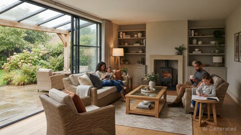
In a British garden, cushions may face passing showers, morning dew and damp evenings. Choose fabric and care details to suit the seating position, not colour alone. A cushion on an exposed lawn has different demands from one beneath a covered terrace. Water resistance helps manage light moisture, but it doesn’t automatically mean a cushion is waterproof or suitable for prolonged exposure to rain.
Check care instructions before choosing a pale cover. Removable, washable covers can make lighter colours more practical and easier to refresh after a mark. Check how the cover comes off and what its label permits. A design that can be laundered according to its instructions is simpler to maintain than a cushion that can only be spot-cleaned.
Quick drying depends on more than the outer fabric. Check the cushion’s care information and construction, then consider where it will dry after a shower. Air movement and a sheltered position can help moisture escape. Beside a brick wall, leave room around corner-lounge cushions rather than stacking them tightly while damp.
Use a simple routine after wet weather:
- Move cushions from exposed garden chairs to a covered area when rain begins.
- Stand damp cushions separately, allowing air to reach both sides.
- Wait until the fabric and filling are dry before returning them to a storage box.
- Follow the cover’s care label when treating a mark or washing the fabric.
These steps matter especially for cream, white and pale grey. Their lighter surfaces can make marks or water spotting more noticeable, so washable covers may make them easier to maintain. For exposed seating, a mid-tone fabric such as taupe is a practical alternative to relying on frequent cleaning for a pristine appearance.
Fabric choice also affects how colour looks over time. A washable cover lets you remove surface dirt, but it doesn’t prevent fading from sunlight. For a sunny patio, consider muted shades and store cushions out of the weather when they’re not in use. A patterned cover can be more forgiving between washes, while plain pale fabric shows its texture and marks more clearly.
Think about the whole cushion, not just its cover. A removable cover is useful only if it can be handled easily and replaced neatly after cleaning. For a dining set used through changeable weather, choose covers with straightforward care instructions and a place to dry them indoors. In a sheltered bistro setting, lighter colours may be easier to keep looking fresh.
Finally, treat water resistance as one part of a care plan. Check the fabric guidance, move cushions out of persistent rain and let them dry fully before storage. These habits help preserve the appearance and comfort of outdoor seating without assuming any cover can withstand every British weather condition.
4. Beige and grey as versatile outdoor colours
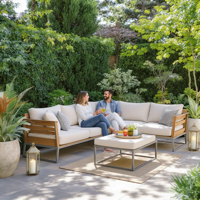
Beige and grey give a garden seating area a composed foundation, allowing cushions and accessories to change with the season. Beige warms pale stone, timber decking and brickwork; grey feels crisp beside concrete, slate and aluminium. Choose a shade that picks up an undertone in your patio, rather than treating every neutral as interchangeable.
Beige ranges from sandy and golden to mushroom and taupe. A warm sand cushion can soften a cool grey frame, while mushroom works with weathered timber and darker paving. For a contemporary terrace, pair stone-coloured cushions with charcoal metal furniture. In a cottage garden, oatmeal shades sit comfortably beside timber and informal planting.
Grey also has varied character. Blue-grey fabric can feel cool against silver paving, while warmer charcoal can ground pale stone or a rendered wall. Before choosing, place a fabric sample beside the frame, paving and house exterior. View it in daylight and shade: the same grey can look different beside warm brick than beside blue-toned slate.
Texture gives neutral designs depth without adding another strong colour. Combine a smooth beige seat cushion with a subtly woven back cushion, or add restrained piping to a plain grey cover. Pinstripes and chevron patterns can break up a broad expanse of grey. Keep pattern scale in proportion: a fine stripe suits a compact bistro set, while a larger motif has more presence on a garden sofa.
Use accessories to shift the mood. Teak accents and sand-coloured cushions create a warm, natural arrangement; blue or sage details introduce a cooler botanical note. On a terrace adjoining a kitchen, echo a neutral shade from the home’s exterior or nearby furnishings. This creates continuity without requiring the outdoor palette to match indoor pieces exactly.
Beige and grey are practical starting points when planting or paving already supplies strong colour. Against roses, lavender and ornamental grasses, neutral cushions let flowers lead the view. In a compact courtyard with patterned tiles, plain fabric reduces visual competition. For a more layered look, add contrast through texture or one accent shade rather than several unrelated colours.
These neutrals suit changing schemes because they work with different accent colours and garden settings. Refresh beige cushions with muted green or terracotta accessories; soften grey with cream piping or textured throws. A considered mix of fabric, frame and paving creates cohesion, while small seasonal changes keep the seating area feeling current.
Beige and grey are versatile outdoor furniture colours that fit easily into different design schemes.
Lighter, more muted colours are advised for outdoor cushion fabrics that should fade less over time.
5. Outdoor cushion durability
Which outdoor cushion colours fade least in sunlight? Lighter, muted shades such as beige, tan and light green are less likely to look faded over time. Pastels and white reflect more light and are less affected by UV radiation, while bright red, orange and yellow upholstery tends to fade faster.
Colour is only part of durability. In a sunny, exposed garden, strong exposure can change the appearance of cushion fabric, while a sheltered terrace experiences different conditions. Dark green fabric is also noted for fading, so don’t assume a deep botanical shade will retain its original look better than a softer green.
For a more fade-resistant fabric, look for solution-dyed acrylic. Its pigment is added before the fibre is formed, helping the colour resist outdoor fading. This construction can matter more than choosing a shade simply because it seems practical. Check the fabric description and care guidance, then weigh its performance against the look you want.
Think about how a colour will age beside the furniture. Fading may be more noticeable on a plain, saturated cushion than on a muted or patterned design. A busy summer print can make faded areas less obvious and keep the seating looking composed. Choose a print that complements the frame and garden palette, rather than introducing several competing colours.
Regular care also affects how presentable cushions remain. Store them out of the weather when they’re not in use, especially during prolonged wet spells. Bring them indoors over winter: damp storage can cause mould, which washing may not fully remove. Let cushions dry fully before putting them away, and follow the fabric’s cleaning instructions.
During the season, turn and rotate cushions so the same surfaces don’t receive all the sunlight. On a garden sofa, swap seat cushions between positions and turn reversible designs where their construction allows. This helps fading occur more evenly, so one cushion is less likely to look markedly different from its neighbour.
Outdoor cushions in Britain can look tired after one season or remain in reasonable condition after three, depending on the shade chosen. That variation makes it worth considering colour, fabric and storage together. For a sunny, exposed patio, choose muted colour and fade-resistant fabric; for a covered seating area, select a stronger accent shade and protect it when unused.
If you’re coordinating durable cushions with outdoor furniture, get in touch about your garden furniture plans.
When comparing fabrics, treat vivid red, orange and yellow as colours that may show sunlight’s effects sooner, rather than assuming every strong shade will hold its appearance equally well. Dark green also deserves consideration: it is noted as a colour that fades, so a deep shade is not automatically a safer option. These tendencies can guide your decision when several colours suit the same outdoor setting.
Make protection part of your regular cushion routine, not just a response to poor weather. Keeping cushions out of the weather when they’re not in use helps them remain presentable. During the season, turning and rotating them helps fading occur evenly across the set, reducing the chance that neighbouring cushions develop noticeably different appearances. Together, these habits support a more consistent look over time.
Rengard: Furniture Accessories
Rengard offers garden furniture and furniture accessories to help bring a considered outdoor setting together. Once you’ve settled on a cushion palette, think about how it will work alongside your garden furniture, from a dining set to rattan seating. Coordinated colours and finishes can help the whole patio feel cohesive.
For help choosing garden furniture to complement your palette, explore Rengard’s outdoor collections.
Make your garden palette your own
Before settling on the best colour for outdoor cushions, consider how your garden seating works as a whole. Think about the balance between the cushions, furniture frame and outdoor table, and whether the arrangement suits relaxed lounging or dining. A cohesive palette can make the space feel intentional while leaving room for seasonal accents.
Rengard’s garden furniture and furniture accessories can help create a coordinated outdoor setting. Consider how each piece fits your patio or terrace, then choose colours and finishes that suit the way you use the space.
Ready to take the next step? Contact Rengard to discuss your garden furniture choices, and create an outdoor setting that feels distinctly yours.
Frequently Asked Questions
What Is the Best Colour for Outdoor Furniture Cushions?
Choose a cushion colour that supports the mood you want: a close tonal match makes furniture feel integrated, while a contrasting accent turns the seating into a focal point. For a garden sofa, keep the main seat cushions consistent and add personality through smaller back cushions. This makes it easier to refresh the arrangement later without changing every cushion or replacing the furniture.
What colours are best for outdoor cushions in the UK?
The most suitable shades depend on how you use and care for your seating through the UK’s changing seasons. If cushions stay out during everyday use, choose a colour you’re comfortable seeing in varied weather and garden conditions. For occasional entertaining, a more expressive shade can make the setting feel ready for guests. Think about the mood you want on an ordinary afternoon, not only at its best.
Which colours work best with common garden furniture materials and colours?
Use the furniture’s finish to decide whether cushions should blend in or create a clear colour break. A solid cover keeps attention on a detailed weave, while a patterned cushion can add another layer to a simple frame. For mixed-material furniture, such as a metal frame with a timber-effect tabletop, choose one finish to guide the cushion colour rather than trying to match every surface.
How do cushion colours affect the look of a small patio or garden?
In a small outdoor space, colour can help define how the seating is used. A distinctive cushion on a single chair can mark a reading spot, while matching cushions across a dining set make it feel like one purposeful area. Consider how much cushion surface is visible when the furniture is empty, too. A bold colour becomes a stronger feature across a whole set than on one accent seat.